Overview
Built the Design System for Arive (Wizni, Inc.) which is a leading loan origination software (LOS) product used by brokers, loan officers, lenders and borrowers. The Arive Design System is a comprehensive system comprising of over 2000 interactive components leveraging the latest features of nested instances, properties and variants.
Role
Sr. UX Designer
Timeline
3months
Background
When I joined Arive (Wizni, Inc.), the team was at a crucial stage of transitioning from Adobe XD to Figma. Recognizing the potential of Figma as a powerful design tool, Aman (Principal Design Lead) took a leap of faith in me and my abilities and made the decision to switch. I was tasked with creating the Arive Design System while my teammates— Vivek and Anjan—were still getting acquainted with Figma. During this transition period, the team continued to use Adobe XD for ongoing projects, while my goal was to have the beta version of the Arive Design System ready by the time the entire team was ready to fully embrace Figma.
Problem
The previous design approach using Adobe XD posed several challenges and limitations that hindered the efficiency and collaboration within the team. Some of the key problems included:
Inconsistency
Poor File Management
Difficulty in Collaboration
Time Consuming
Brand Dilution
Increased Maintenance Overhead
Research
To lay the foundation for the Arive Design System, I embarked on an extensive research phase. My first plan of action was to deeply understand the company's values, design philosophy, and target audience. As a newcomer, I dedicated countless hours immersing myself in the product and experiencing it through the lens of a new user. This approach allowed me to gain valuable insights and identify pain points that needed to be addressed through the design system.
Recognizing the diversity of user groups at Arive, I focused on understanding the unique needs of designers, developers, and end users. By collaborating closely with these stakeholders, I ensured that the design system catered to their respective requirements. This comprehensive research phase also involved studying existing design systems, such as Atlassian, Polaris, Carbon, and Ant, to gain inspiration and insights into best practices.

Atlassian Design System

Polaris Design System

Carbon Design System

Ant Design System
During my research, I stumbled upon the concept of Atomic Design, which proved to be a pivotal discovery. Inspired by this brilliant concept, I incorporated its principles into the Arive Design System. Atomic Design enabled me to break down complex design problems into smaller, more manageable elements, fostering a modular and scalable approach to component creation.


Implementation
Implementing the Arive Design System came with its own set of challenges. As Figma was continuously evolving, there were instances where certain features, like Nested Instances, were still in beta. However, I was determined to leverage the latest functionalities and stay up to date with the cutting-edge capabilities of Figma. This required a proactive approach, closely following Figma's updates and adapting the design system accordingly.
Throughout the implementation process, I worked closely with the design and development teams, fostering a collaborative environment that encouraged feedback and iteration. This iterative approach ensured that the Arive Design System evolved organically, meeting the specific needs of the teams and aligning with the overall product vision.
Please Note
Arive Design System is not publicly accessible and is protected by an NDA. Therefore, the screens presented below are sourced from my personal open-source project, Concept Design System. I am developing this project based on the knowledge and insights gained from working on the Arive Design System and various other design systems.
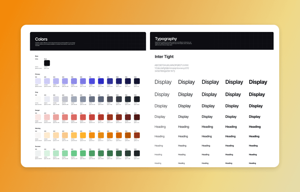
Foundation
Typography and color choices serve as the foundational building blocks for all design components; they are the fundamental atoms of the design system. These elements not only establish the visual aesthetics of a product but also convey the brand's identity and overall style. In our approach, we leveraged cutting-edge variable properties for typography and color management
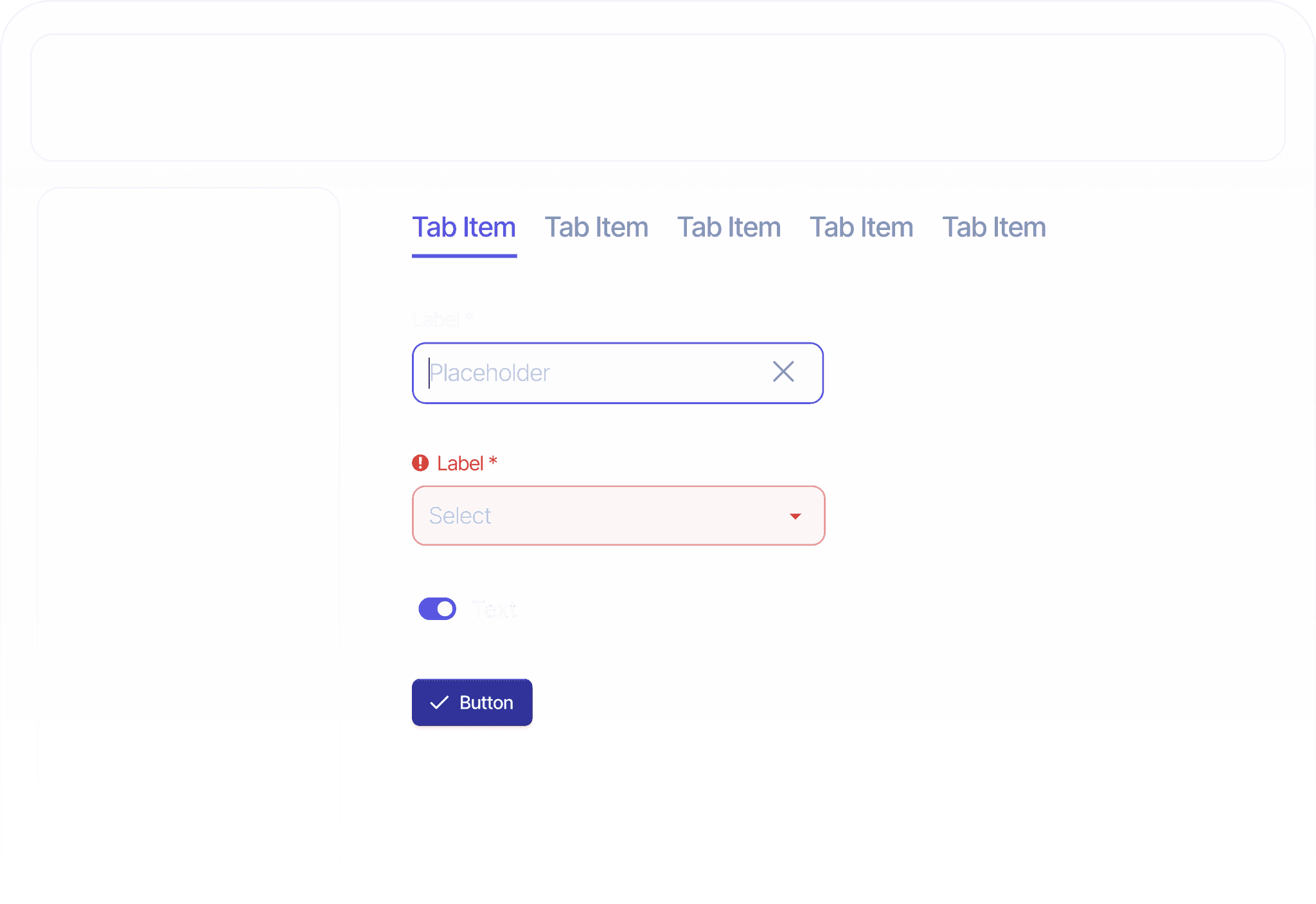
Button
Surprisingly, one of the most challenging components turned out to be the button, with the icon taking most of the blame. Our requirements included the need to change the size and color of the icon while ensuring it remained consistent in size and color during other states, such as hover and pressed. We initially attempted to use the Icon Wrapper as recommended by Ridd, but it proved to be ineffective for this use case. It took a considerable amount of exploration and valuable help from the community, but we eventually managed to resolve the issue using a union.

Tooltip
The product incorporated tooltips in various instances to provide additional information. These tooltips needed to display arrows on different sides and not just at the center of those sides but also at various positions. To address this challenge without having to create 50 different variants, we leveraged the Auto Layout Alignment property.

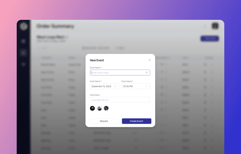
Modal
The culmination of all molecule components, such as buttons and inputs, helped us in the development of modals and other intricate components. We designed various modal variations, including full-page, centered small, centered large, bottom, and side modals. To handle the dynamic content within the modals, we utilized slots.
Impact
The impact of the Arive Design System on the design and development process was profound. By providing a comprehensive library of reusable and consistent components, the design system accelerated the speed of executing new designs and features. It brought a new level of efficiency to the development process, enabling developers to replicate existing designs seamlessly while maintaining consistency.
The Arive Design System also addressed the issue of inconsistency that plagued the previous design approach. By standardizing design elements across the entire product ecosystem, it eliminated the discrepancies and variations that had hindered the user experience. This consistency not only enhanced the overall visual appeal but also improved usability and reduced the learning curve for both designers and end users.
Reflection & Thoughts
Design
The process of building the Arive Design System was an incredible learning experience. While I had previously utilized components in my design work, developing an entire design system at this scale took my understanding to new heights. Witnessing the power of master components, where changes made to a single component propagated across thousands of screens, was truly awe-inspiring. Beyond design skills and mastering Figma, this endeavor taught me the importance of discipline, patience, and consistency in creating a successful design system.
Technology
The implementation of a design system not only boosted the speed and efficiency of design execution but also significantly accelerated the development process. With the advent of features like Dev Mode in Figma and other tools aimed at enhancing the designer-developer handoff experience, implementing a design system will become easier than ever whether your team is using React, Swift, Flutter, or Angular.
Business
While startups building minimum viable products (MVPs) may initially overlook the need for a massive design system, I firmly believe that every company that has achieved product-market fit and is generating revenue should invest in a design system. Despite the significant investment of effort and time required in the beginning, the long-term benefits are undeniable. A design system ensures consistency across all products, reduces execution time, improves the efficiency of designers and developers, and ultimately leads to the development of more products and features, resulting in increased revenue.
Other Work


Live
iSchoolConnect
Designed and improved the experience of multiple Ed-tech products